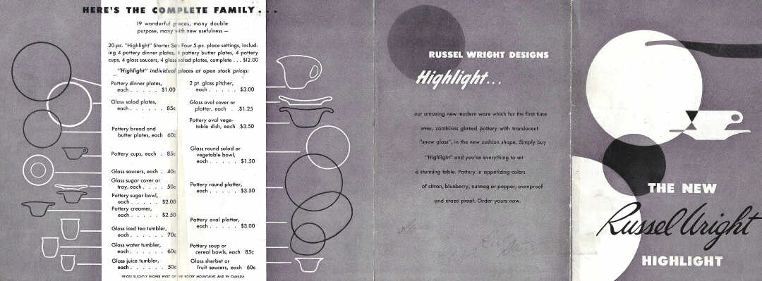
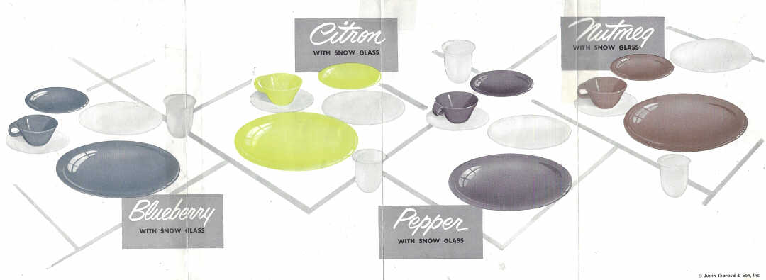
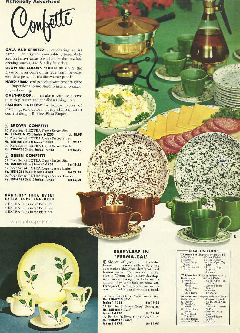
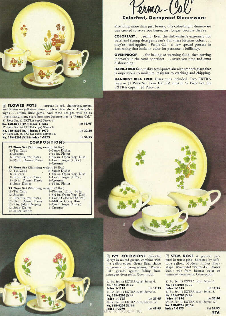
|
The Paden City Pottery Company operated in Paden City, West Virginia from 1914 until 1963. The following article was written by Lucille T. Cox and ran in several pottery trade publications in 1939. It describes the Paden City Pottery's early history as well as various lines being offered at the time. Photos shown did not appear with the original article.
The history of the Paden City Pottery Company and the town of Paden City, West Virginia, are interwoven so tightly it is impossible to separate the story of both.
In 1901 a group of business men form Pittsburgh, Pennsylvania were hunting for a town site. The Ohio river valley was a right industrial center and they planned to form a land company, lay out a town, invite industries to locate and reap profits from their investments. However, there had been serious floods along the Ohio and many of the so-called safe river villages were inundated. Therefore the first requisite for the new town had to be high ground and if possible, natural gas.
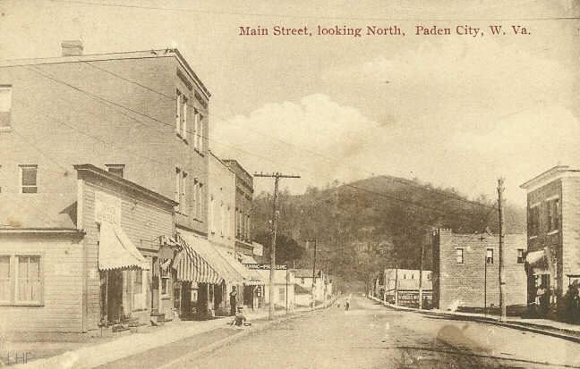
Paden City, West Virginia. Circa 1915.
All of their requirements were found in three farms bordering the river and owned by a man named Paden. The company purchased the land, plotted the town and named it Paden City in honor of the original owner. When the work of organization was successfully under way, the company formed the town's first industry, The Paden City Pottery Company. The president of the pottery was George R. Wallace, a Pittsburgh attorney. The pottery had a five kiln capacity and while they were of the most modern type then available, it required twenty-one days to make and fire the ware. Their original line was kitchen and art ware in brown and white.
[In the 1920s] the organization announced that they had adopted a new policy. Their product would be completely changed and from that time on the Paden City Pottery Company would manufacture dinnerware. It was a courageous move at a time when national economists were discussing recession. But this action only indicated the mettlesome character of the firm under direction of the new president, Charles S. Ray.
This aggressive characteristic has marked the Paden City Pottery Company so definitely that today they are recognized as a very progressive organization. They are willing to try new ideas both in the pottery production and the sales department.
They were the first semi-porcelain plant to install and use sand-blast scouring for bisque. They were also the first semi-porcelain plant to use their spraying apparatus for the application of colored glazes. One of the interesting pieces of machinery in the Paden City Pottery Company is the spraying machine. It applies the glaze so evenly it would be almost impossible to duplicate the work by hand application. Another feature of this particular machine is that there is absolutely no waste in glaze, thereby giving a better product at a low cost.
The kilns of the Paden City Pottery Company are now circular and it is interesting comparison to know it now takes but seven days from the clay shop to the shipping door.
Every piece of equipment is purchased with the idea of maintaining their standard of ware, speeding up production and keeping cost moderate. In order to do this the organization never slacks its watchfulness for new ideas in equipment. They argue it is poor economy not to take advantage of every up-to-the-minute invention in pottery machinery. Their shipping facilities are splendid. They can load for freight cars at one time and also have access to river and motor freight transportation.
It is small wonder the Paden City Pottery Company does not know the meaning of the word, depression. As the visitor walks through the plant he is impressed with the hum of activity, the whir-r-r of machinery and the clatter of dishes.
Behind every active pottery is a buys sales force and much of the success of Paden City Pottery Company can be traced to the indefatigable leadership of J. W. Mackey, sales manager. Mr. Mackey has been with the pottery since 1930 and his story of the various lines offered over those years is vivid and interesting.
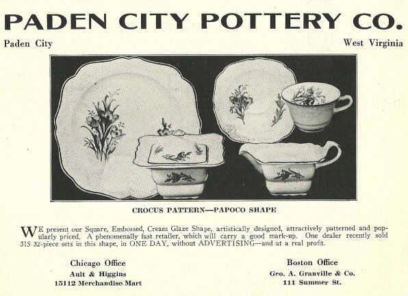
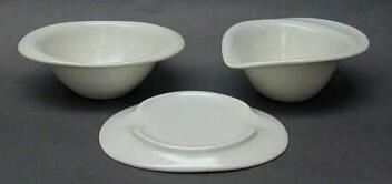
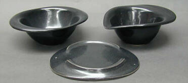
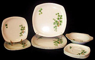
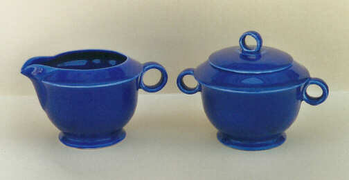
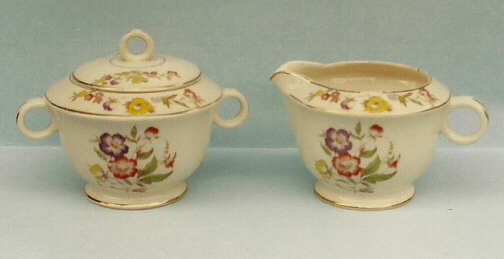
The first successful line of Paden City was the "Papoco," an embossed shape. The name was a derivation of the name Paden Pottery Company. This was followed in 1931 by a square shaped dinnerware offering called the "Regina." Every pottery has one line whose appeal to the buyer never dies and that is the case with the Regina. It is as popular today as it was when introduced eight years ago.
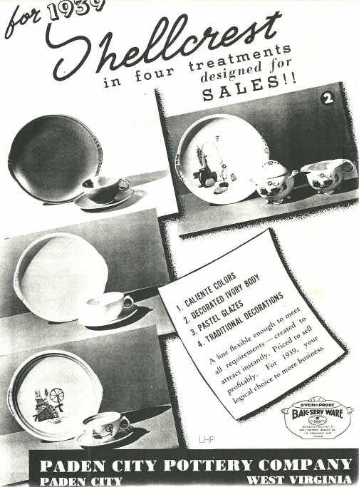
Having established a reputation for good kitchenware it was not difficult for Paden City Pottery Company to bring out a successful baking ware called Bak-Serve. The designing of this ware is not of the fantastic lining sometimes prevalent in bake and kitchen ware. It is conservative in shape, decorated on a cream glaze and appealing to all women buyers because it is not only attractive but easy to keep clean.
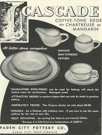
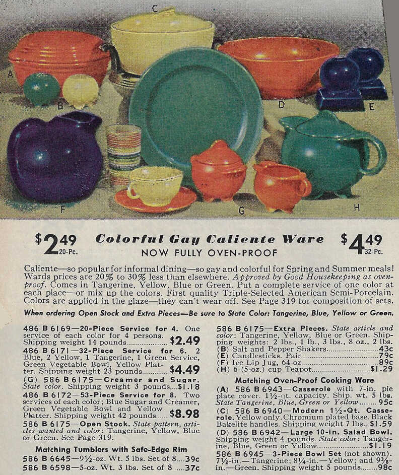
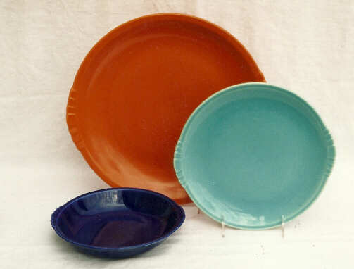
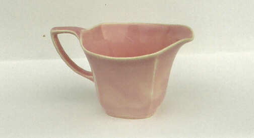
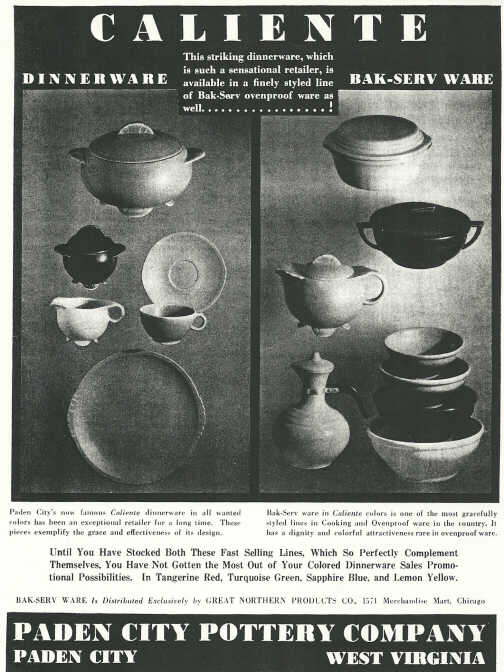
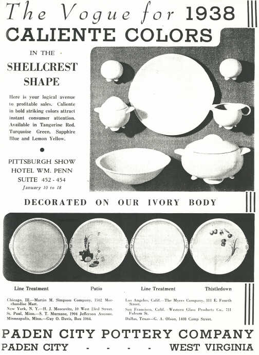
The majority of Paden City Pottery Company's shapes are clever in their styling, but there is one particular line that immediately attracts attention and, what is better, retains it. That line is the Caliente. Its charm is in the romantic flare given to it by the lovely colors and delicate lines of the Shell Crest shape on which is was created.
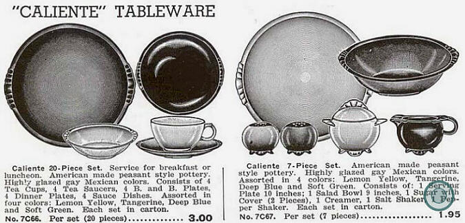
Late 1930s ad for Paden City's “Caliente”
Courtesy: Candy Fagerlin
Caliente immediately appeals to the imagination because it has a certain Spanish influence in its styling. Mr. Julius Hertsberg of the S. Kann & Sons Company of Washington, D. C., the oldest dinnerware buyer in the United States, from the point of service, recognized this Continental characteristic in the then unnamed shape and christened it "Caliente" which is the Spanish word meaning hot. Mr. Hertsberg, who has been forty years with one house, was an authoritative person to name the line, his experience in recognizing attractive dinnerware is inestimable.
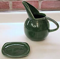
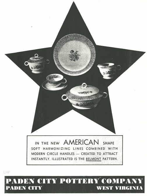
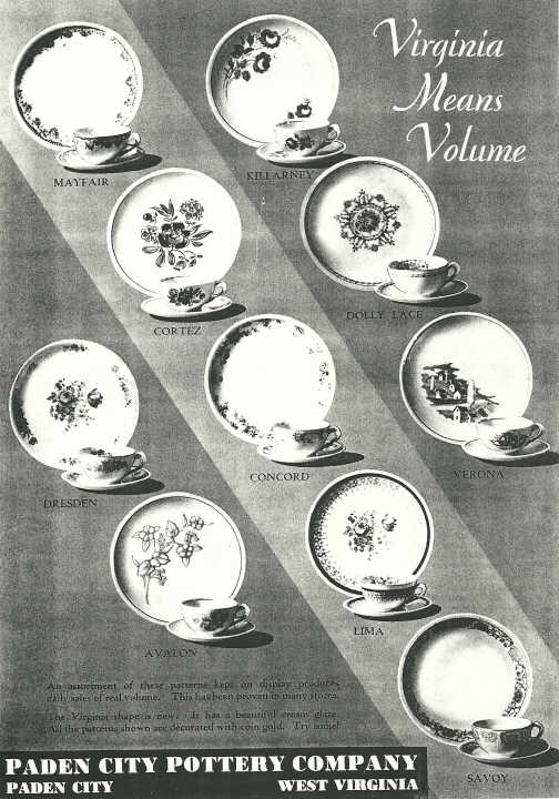
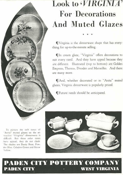
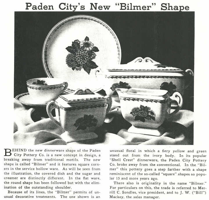
The Paden City Pottery Company introduced a new shape, the "Virginia" at the Pittsburgh Pottery and Glass show in January. It was an instantaneous success. The Virginia is rectangular in lines and capped by many graceful designs. One of the most charming is the "Thistledown." [webmaster's note: This shape discussed was initially called "Bilmer", but the name was soon changed to "Virginia" in early 1939.]
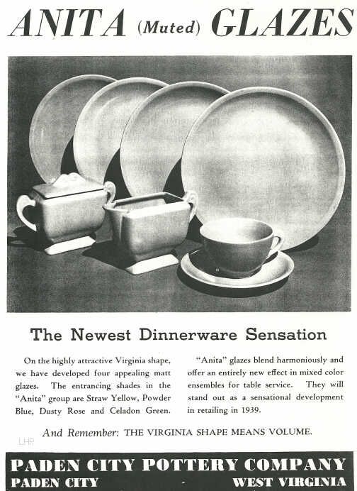
The firm is now planning a fascinating new offering. They have combined the refreshing vivacity of the Caliente with the conservative lines of the Virginia, used a new matt glaze treatment and called it the Anita. The colors used on this offering are yellow, turquoise green, robin egg blue, and rose pink. It is the Caliente in a new dress with a personality of its own. The debutante, Anita, makes her bow to the trade this Spring and should have a successful season. If it can match the reception of the Caliente it will be spectacular to say the least. Last year sixty per cent of the production of Paden City Pottery Company was traced to the sale of Caliente ware.
This pottery, with a background of successful lines and constant operation, has joined another aggressive movement. They are one of the five concerns participating in the American Potter's exhibit at the New York World's Fair. Adhering closely to the policy of the exhibitors, the Paden City Pottery Company will show only a few choice pieces of their ware. It will be difficult for them to make a just selection as the majority of their lines are well worth exhibiting as first choice of their production.
The present officers of the firm are Charles S. Ray, President and general manager; M. C. Sondles. vice president; Thomas Watson, secretary -treasurer; J. W. Macky, sales manager; W. J. Ford, plant superintendent.
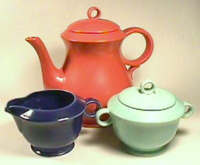
"New Virginia" teapot, sugar and creamer in Caliente glazes.
Courtesy: Fran and Carl Stone
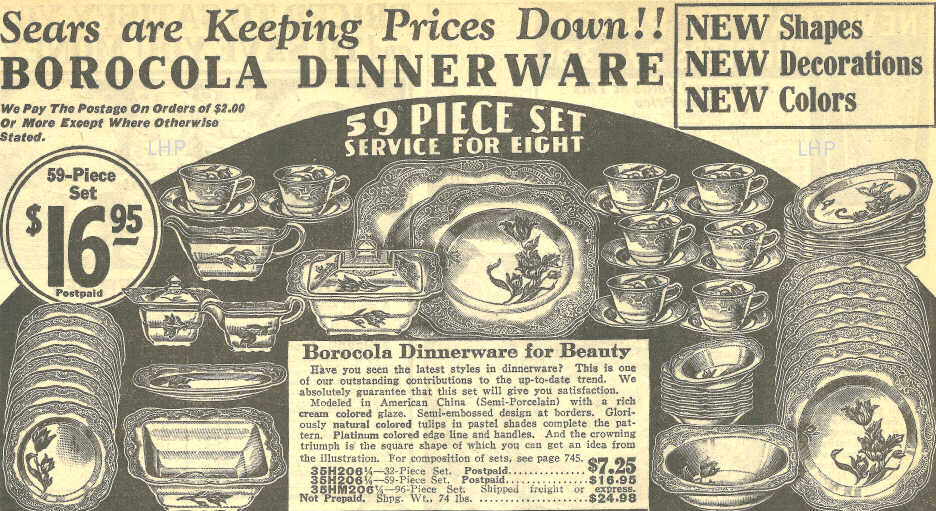
1932 advert for "Borocola" on Paden City's Papoco shape.
|